Showing posts with label Photography. Show all posts
Friday, 7 February 2014
Monday, 15 October 2012
Having a makeover....
My current uni assignment is Digital Communication so I have been taking the opportunity to do my much needed, well overdue rebrand.
I have tried to bring cohesion between the two areas of my work, design and photography by giving a main brand and seperate sub-brands with subtle differences.
Here is the brand design and the loose plan for the new website/ portfolio.
Thanks to Dan de Castro for the portrait of me!
I have tried to bring cohesion between the two areas of my work, design and photography by giving a main brand and seperate sub-brands with subtle differences.
Here is the brand design and the loose plan for the new website/ portfolio.
Thanks to Dan de Castro for the portrait of me!
For the complete assignment I was awarded 73 points
Thursday, 20 September 2012
High Clarity - trial and error - Photoshop
I have been trying out tools to produce High Clarity effects in Photoshop. I have used sharpen, shadows, black and white filters and blending modes, with varying degrees of success.
The first one using a photo of Rob wasn't very good. Not sure if the natural light hindered it, or if the image just wasn't good enough. I wasn't very close to the subject and in terms of photoshop, would not use the hide mask for the background again for these kind of portraits.
My second attempt was a photo of Tudur Owen, taken with flash and I was closer to the subject. I also added an additional black and white layer.
Friday, 1 June 2012
Nutall Park Mummy and Baby shoot
Here are a selecion from the shoot we did on Wednesday with my fellow Water Babies ladies and their gorgeous babies!
I've got the gallery of rought cuts for the mums to peruse, once we have our shortlists I can publish the gallery.
I couldn't choose my favourite from Poppy and Tanya's shoot as they were all stunning, so will wait for her cull before I make my selection :)
I had great fun and all the babies were such pros, can't wait to do more.
Wednesday, 30 May 2012
Sunny day for Mummies and Babies
What a great time to be on maternity leave! Today Bear and I spent the morning photographing the Mums and Babies from Water Babies, in Nutall Park.
I'll blog some pics soon but I just wanted to tell you all how proud I am of Bear, he played and kicked about in the sun while I snapped away. He wasn't the focus for today and I just caught him on the fly, hence the quality of this shot not being the highest.
Needless to say, I love this head!
I'll blog some pics soon but I just wanted to tell you all how proud I am of Bear, he played and kicked about in the sun while I snapped away. He wasn't the focus for today and I just caught him on the fly, hence the quality of this shot not being the highest.
Needless to say, I love this head!
Monday, 14 May 2012
Happy Anniversary Mark and Emma
A year ago today two of our most special friends were married, I had the pleasure of photographing their big day.
Happy Anniversary guys! xx
Tall Short - Digital Illustration 3
Tall Short
The theme is purveyed through
the obvious means of tall chap and a dwarf, in the style of Vaudeville with a
contemporary spin. It’s quite punchy and
comedic which I feel will be memorable.
The featured subjects are
from a Photograph. I traced them with
the pen tool and created a mask to reveal just them. I used the mask to cut
them out to create a blurred effect on another layer.
I upped the contrast, added
a colour layer to make it look sepia, the majority of Vaudeville images I have
seen are in Sepia. The blacks were
darkened, I added a dark corner with the gradient tool with a soft light blend,
darkening the image slightly.
Another colour layer was
added, set to Exclusion, which softening the colours but brightening some of
the features and upped the contrast slightly.
Lastly I went round the
subjects with the smudge tool to soften up the edges and refined the mask.
I created another layer
below the subject composite. Using the
custom tool I created a target, a cross, a rectangle and line tool, rotating
them with transform.
I used Illustrator to
create 2 black curves with the pen tool, using the blend tool with specified
steps, duplicated curves filling the space giving a gradual colour change. This swirl moves the eye away to the
background giving a sense of depth. I
also used Illustrator to create a checkerboard grid.
The shapes were placed asymmetrically
to balance out the overall image, and enhance the contrasting heights of our
subjects. There is equal distance
between the top of Tall’s head and the top of the image, and that of the
distance between his centrally positioned foot and the bottom of the page. This foot is closer to Short’s foot which
makes the eye draw to this more concentrated are, it feels heavier and
therefore cheats the usual balance approach.
The edges of the bottom shapes are set equally away from their closest
edges.
The top layer, with the
subject matter and all it’s effects, was set to the blending mode Pass Through,
which allows the effects to be active on both the group and the layer beneath
it.
Mark awarded = 73
Mark awarded = 73
Friday, 11 May 2012
Earth Sky - Digital Illustration 2
Here is the second submission for the Digital Illustration series.
Acknowledgements and thanks are shown in the previous post.
Mark awarded = 73
Acknowledgements and thanks are shown in the previous post.
Earth/Sky
The theme was inspired by
the Genesis story day two, where he makes a firmament. The photograph that I used in the background
of the image, it is Traeth Llygwy on Anglesey .
I liked the balance of the land and the heavily clouded sky, how they
are separated by the headland and the way the ripples on the beach travel at a
contrasting angle.
In the story, God creates
a firmament (a process of separating), which is the sky, to separate the waters
from each other, these waters are heaven and the ocean. As yet God hadn’t created the land. In my interpretation however I am using the
headland as the firmament. The beach has
it’s own ‘waves’ created by the ocean. I
think I am granted a little artistic license and hope purists will turn a blind
eye to my inclusion of the land.
In this design I set a
texture layer as the background. I
applied a warming photo filter and dry brush effect to the photograph, adding a
gradient, overlayed, to enhance the colours in the sky, masking the headland so
as to not affect it’s appearance. There were some posts also cut away from the
horizon using the heal tool.
I sketched out some
handrawn brush strokes around the headland, clouds and some of the beach
ripples, these were blended with soft light layer option. These are very subtle but accent some of the
features without being too dramatic as there is a lot going on visually and I
don’t want it to be too busy.
These elements were
grouped and a mask was applied, inverted and then watercolour brushes were
painted on to reveal the image. The
layer blending option was set to pass through allowing all the group layers to
be actioned first and the composite is blended with the layer below, the
texture, to create a stencil. This makes
it look like the brushes have washed away the sand and revealed the beach
scene.
I then used the pen tool
to create some vector waves. This new
layer was blended with overlay. I added
a new layer and painted some translucent paint effects to look like there was
watercolour painted ontop.
The next step was the
addition of text, I chose a formal traditional font to reflect the formality
and importance of the message. To give
it an aged, distressed appearance I rasterized the layer and added noise for
texture, adjusted the levels and added paint splats to look as though water had
been spilt on the ink.
I feel the image tells
the story and really looks as though God is busy at work, creating his artistic
masterpiece and splashing the waters about merrily.
Mark awarded = 73
Wednesday, 9 May 2012
Digital Illustration 2012
I have completed my first submission for the new assignment, Digital Illustration and Motion Graphics.
The first section, Digital Illustration has 3 submissions each on the theme of Contrasting Opposites. We will then chose our favourite and create an animation using, I think, After Effects.
So here is week 4's submission, Masculine & Feminine. I have to write a 300 word piece to accompany it, posted below.
Masculine/Feminine
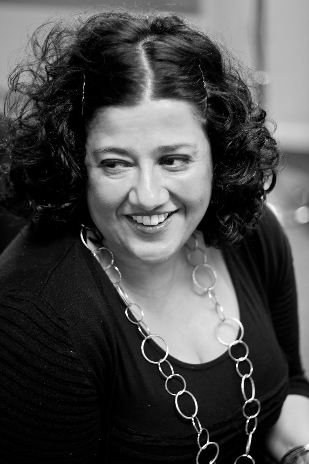
I upped the brightness
and contrast on the portrait of Phil, who was set in frame using the 2/3 rule. I cut him out using the pen tool, duplicated
the layer and applied a watercolour filter.
The original layer was adjusted
with threshold. Setting a level, for
lighter pixels turn to white and darker to black. This is a great way to get contrasty B&W
images from a colour or greyscale pic.
I blended the two layers
with multiply and merged them, this allows the colours to show right through
the white parts of the image on the above layer.
I set a new layer and
painted some splats with my new watercolour brushes, selecting what I perceive
to be girly colours, pinks, purples, golds, bright shades of green and
turquoise. These colours I feel are in
contrast to the portrait of a chap who is very much a blokey bloke. To really hit the message home I included the
combined male and female symbols.
I added a layer mask to
this ‘colours’ layer. I copied the image
from the ‘merged’ layer, inverted the colours so the layer mask hid the Blacks,
and reveals the Whites and hid the ‘merged layer.
I created a new layer
which sits beneath the ‘coloured head’. This was to give the appearance of
light trails. To do this I did a rough
lasso around the head and set a pink gradient radiating from behind the head
and shoulders. This gives an element of
depth. I used the lasso tool as to contain the gradient, as the blending mode
of the other layer allows the colours to shine through, I didn’t want this.
For the light trails
themselves I drew some swirls with the pen tool and I applied the brush tool to
the path, in white. I selected the blend
mode on the layer and applied a pink colour with outer glow. I duplicated this layer twice, adding a
gaussian blur to one and a radial blur for a vibration effect on the other,
offsetting them slightly.
I duplicated and merged
these layers, blending as overlay. This
option both darkens the darker colours (as multiply) and lightens the lighter
areas (as screen does).
Next I added more light
trails and glitter using some brushes that I downloaded. The glitter gives a bokeh effect which I am
rather partial to.
I scanned in a painting
of a tropical flowers, duplicated this, changing the colours with the replace
colour tool, rotating with transform.
Lastly I added a
background texture using a photograph of some flowers, I applied the photocopy
filter, inverted the colours and played with the levels and opacity.
Must thank a load of people who helped me create these:
Axeraider70 on Deviant Art for the light brushes, honeydesign for the Sumi Ink brushes, whatsername777, madamsvito and qbrushes for the coffee stains. Bluefaqs, Abduzeedo and Rahul Jha on 10steps for the tutorials for watercolour effects, Wegraphics and Sandy on Brusheezy for the watercolour brushes and Brushking for the Fake Glitter brush. Mustn't forget, actor Phil Higton, for having such a great head!
Mark awarded = 73
Monday, 23 April 2012
Wednesday, 14 March 2012
Portraits for Brighter Business Solutions
A couple of weeks ago I had the pleasure of photographing the ladies at BBS in Ramsbottom for their website portraits.
I have posted my favourites here, but have a look at BBS' website to see what they selected as their favourites.
Subscribe to:
Posts (Atom)